Design
Combining multiple irises in one image
Couples, families, partner pieces: as soon as more than one iris shares a frame, the result is no longer decided by how each iris was edited but by how they relate to each other.
Short answer
Four things decide a multi-iris composition: a common brightness and colour basis across all irises, deliberate size relationships, an arrangement with clear visual entry, and soft transitions at any contact point. Most problems come not from the arrangement but from differing capture conditions between the individual eyes.
Before composing: create a common basis
Irises from different captures — even from the same person in the same session — nearly always differ in brightness and colour temperature. Viewed individually that goes unnoticed. Side by side it does not.
So matching comes before arranging: bring all participating irises to a common brightness, then align colour temperature, and only then compose. Arranging first and matching afterwards means doing the work twice.
Quality check
Lay the irises side by side on neutral grey before composing. Differences in brightness and colour cast are far easier to spot there than on the dark background they will end up on.
Two irises
Side by side
The calmest solution: equal size, equal height, even spacing. It works for couples and for both eyes of one person. The spacing should not look accidental — roughly a quarter to half an iris width reads as a deliberate setting.
Overlapping
Two slightly overlapping irises suggest connection, which is why partner pieces use it. The contact zone decides: a hard cut at the overlap destroys the effect immediately. The transition should run over a narrow band in which the rear iris stays visible rather than being sliced off.
Offset
Different sizes and heights create dynamics and a clear hierarchy — one iris leads, the other accompanies. Useful when one of the two captures is technically stronger: the better one becomes the larger one.
Three and more
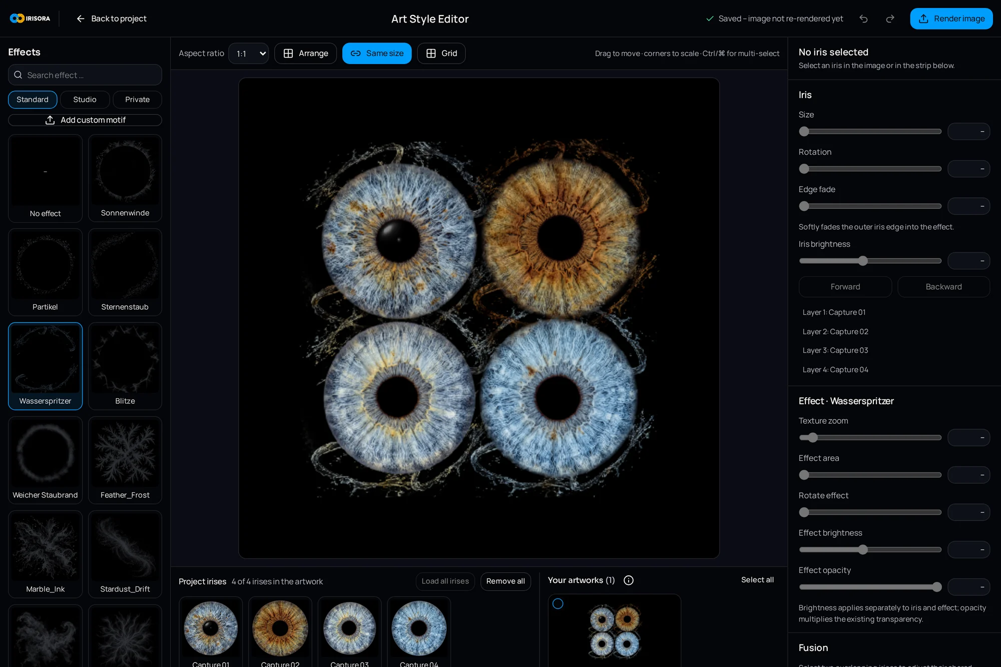
From three irises on, arrangement becomes the actual design task. Three patterns hold up: the row (equal size, equal spacing, calm and documentary), the triangle or circle (balanced, works for three to six), and staggering (one large iris in front, smaller ones behind, creating depth).
The more irises, the more important equal treatment becomes. Among six, one that is brighter or more saturated than the rest reads as an intruder no matter where it sits.
| Count | Proven arrangement | Critical point |
|---|---|---|
| 2 | Side by side or slightly overlapping | Spacing and contact zone |
| 3 | Triangle or row | Equal size, otherwise one looks favoured |
| 4 | Square or two pairs | Even spacing |
| 5–6 | Circle or staggered | Uniform brightness across all irises |
Transitions and hard seams
Hard seams come from one of two causes: too sharp an isolation edge, or a brightness jump between iris and background at the point of contact.
For the first, an even, soft mask falloff — a very narrow transition is enough and looks more natural than a pixel-sharp edge. For the second, slightly darkening the contact zone or placing a minimal shadow beneath the front iris makes the overlap readable as depth.
Common mistake
Visible bright fringes at overlaps come from the isolation, not from the composition. The cause sits one stage earlier — see how to isolate an iris.
Visual entry point
A multi-iris image still needs somewhere for the eye to start. Without one, the gaze bounces and the image feels restless.
Means of guidance: one iris slightly larger, one marginally brighter, one placed more centrally. One of the three is enough — applying all three at once makes the difference look heavy-handed.
Colour differences between people
In couple and family pieces, different eye colours meet by definition — a light blue and a dark brown iris, for instance. The instinct to 'match' them is wrong: the colour difference is the content of the image.
What gets matched is what comes from the capture rather than from the eye: overall brightness, white balance and contrast range. The eye colour itself stays. That boundary is described in keeping natural iris colours.
Important
At equal capture brightness, a dark brown iris shows less visible structure than a light blue one. That is a property of the tissue, not an editing failure — when in doubt, place the darker iris slightly larger so its structure gets room.
Consistency in the finished image
IRISORA builds multi-iris compositions in the art style editor: all participating irises receive the same design parameters, arrangement and size relationships stay adjustable, and the result renders at the same output size as a single iris.
- Same effect treatment across all irises — no glow on just one
- Same mask falloff everywhere
- Same sharpening; differently sharpened irises look pasted together
- One shared background rather than a background patch per iris
- Check every contact zone at 100 percent before export
Frequently asked questions
- Do all irises need to come from the same session?
- No, but identical capture conditions make the work much easier. Where captures come from different appointments, matching brightness and colour before composing is mandatory.
- How many irises fit sensibly in one image?
- Up to about six, each iris stays large enough to show structure. Beyond that the image turns graphic and each iris becomes an element rather than a subject.
- Should the left and right eye be mirrored?
- Mirroring creates optical symmetry but no longer shows the real eye. For documentary work, do not mirror; for purely creative pieces it is a legitimate choice.
Related reading
Build couple and family pieces
Combine several prepared irises into one composition and save the arrangement and design as a template for the next client.
5 free iris edits included