Technology & image quality
Keeping natural iris colours
Clients know their own eye colour. That makes iris work one of the few areas of image editing where the viewer brings the reference with them.
Short answer
Believable iris colour comes from correct white balance at capture, restrained saturation and local rather than global contrast. What gets adjusted is the reproduction of the capture conditions, not the colour of the eye. Once the hue itself is shifted — brown to amber, blue-grey to turquoise — it is a creative treatment and should be named as one.
Where iris colour comes from
Iris colour is not a layer of paint. It results from the amount of melanin in the front of the iris combined with light scattering in the deeper layers. That is why perceived colour changes with light direction and light colour more than in most subjects — blue irises especially, since their colour is almost entirely scattering.
For editing that means two captures of the same eye can show different colours and both can be correct. The reference is not the file; it is the eye under neutral light.
White balance and light colour
Settle it at capture
A light source with a known, constant colour temperature and a fixed white balance saves the most work later. Mixed light — continuous plus window light, or two LEDs from different batches — creates colour gradients across the iris that can only be corrected locally afterwards.
Shooting raw is not a luxury here: white balance stays freely adjustable until development.
Use a neutral reference
An iris capture contains a usable reference: the sclera. It is not pure white, but it is largely neutral. A clear cast in the sclera points to white balance, not to the eye.
An already isolated iris has lost that reference, which is another reason to settle white balance before isolation.
Practical tip
A grey card frame at the start of each session takes ten seconds and turns white balance for every following file into a setting rather than an estimate.
Saturation: the usual mistake
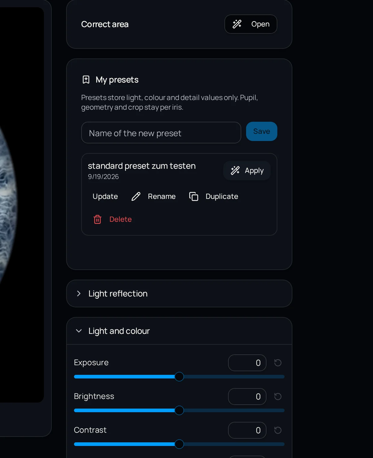
Saturation is the control that rewards most on screen and damages most in the result. A 30 percent lift looks brilliant in preview and produces an eye colour that does not exist.
Two technical side effects come with it: oversaturated areas lose detail as individual channels clip, and high saturation amplifies colour noise, which sits precisely in the darker iris regions.
| Adjustment | Effect | Assessment |
|---|---|---|
| Correct white balance | Removes the light source's cast | Restores the real colour |
| Small saturation lift | Compensates camera flatness | Acceptable in small steps |
| Large saturation lift | Colour exceeds the real eye | Changes the eye colour |
| Hue shift | Brown becomes amber, blue becomes turquoise | Creative — label it as such |
| Local contrast lift | More visible structure | Acceptable, in moderation |
Contrast: global versus local
Global contrast across the whole iris deepens the darks and lifts the lights. On a dark brown iris that means the fine structure in the dark zones goes first.
Local contrast — micro-contrast at small scale — brings out fibres and crypts without shifting overall brightness. For iris images it is almost always the better tool.
The margin is narrow: too much micro-contrast produces bright halos along every crypt edge. That is only visible at 100 percent, never in a fit-to-screen view.
Light and dark irises need different handling
- Light blue and grey: structure lives in the midtones, little saturation needed, avoid blowing out the brightest fibres
- Green and mixed colours: often zonally different — global saturation affects one zone more than the other
- Brown: structure lives in the dark values and needs local brightening rather than saturation
- Very dark irises: reveal their detail through careful lighting; little can be added afterwards
Important
Brown irises carry a high red component. Lifting saturation in the red channel tips them toward orange — a hue viewers recognise as wrong even when they cannot say why.
Natural or creative — keep them separate
Both routes are legitimate. A colour-designed iris image can be a fine product, and many clients specifically want one. The problem is only ambiguity: an image sold as natural but clearly altered invites questions.
A practical approach is to use two names in conversation — for example 'true-to-life version' and 'designed version' — and to deliver both when in doubt. The design possibilities are covered in how to create iris artwork.
Checks before delivery
IRISORA handles colour and contrast inside the iris area and issues every version with a quality check, so conspicuous deviations surface before delivery. How that fits the overall pipeline is on the iris photo editing page.
- Place the edit next to the untouched version: is every difference defensible?
- Check the sclera where still present — a cast there reveals white balance
- View both eyes of the same client side by side
- At 100 percent, look for colour fringes along crypt edges
- Verify on a second, calibrated display
Frequently asked questions
- Why does the iris look different in the photo than in the mirror?
- Because light colour, light direction and pupil size change the perceived colour. Blue irises react most strongly, since their colour comes from light scattering.
- Is it acceptable to change eye colour on request?
- Yes, that is a creative service. It should simply be named as such and not delivered as a true-to-life reproduction.
- How much saturation is still unobtrusive?
- No single number applies, because cameras and raw development start from different points. The reliable test is comparison with the untouched version: as long as the hue is recognisably the same and no detail is lost, the adjustment holds.
Related reading
Check colour reproduction on your own file
Upload a capture and compare the prepared version against your original. Five free edits, no base fee.
5 free iris edits included